Posts

Showing posts from October, 2017

THE BIG ISSUE ESSAY

Image
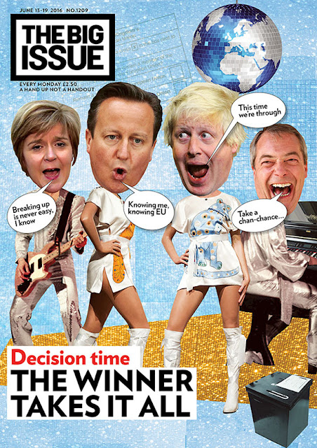
Analyse why The Big Issue magazine has used a intertextual approach to the referendum on its front cover...  This Big Issue cover uses intertextuality to create a humorous but powerful reference to the current Brexit debate. Hence, by siding this significant political event with a 70's pop group, the juxtaposition creates added value which a standard magazine cover on Brexit wouldn't produce. The Swedish pop group, 'ABBA', were a typical 1970's band, producing record-breaking hits. The use of lyrics and the image of iconic 'ABBA' costumes all produce a very clear understanding of the meaning behind the cover page for the reader. This is especially important for The Big Issue magazine as its readers are buying it in the streets; therefore it needs to be eye-catching, with them being able to establish an understanding of what the following articles will be off, based from the cover page. Sweden is in the European Union, consequently this adds to the

COMPARING EDITORIAL COMMENTS

Image
The Guardian The Daily Mail Similarities Both articles use a small masthead, this helps the reader to identify the editorial comment section easily, and helps to separate it from the rest of the articles in the newspaper. Both also choose to write their articles in column style, all text based, with no images to accompany it. As well as this, both newspapers use an authoritative and persuasive tone; this helps the publisher to get their point across to their readers, spreading their opinion. Though, in either newspaper, this doesn't come across as too upfront  as the readers of each newspaper already agree with the ideologies of the paper.  The editorial comments in both newspapers use subheadings, these are shown separate to the rest of the copy, helping to outline the opinion of the following article. Similarly, all the comment sections which the Daily Mail and the Guardian write are on current affairs. This appears to the audie

THE BIG ISSUE - FRONT COVER ANALYSIS

Image
E.g. In this Big Issue front cover, the simplistic and minimal approach makes it very clear to the reader what the focus of the later articles is. The Masthead of the magazine is located in its traditional position, in the top left of the page. Its large size and choice of contrasting colour, matching the theme of the magazine cover, all help to make its iconic style stand out. The font of the Big Issue has a similar aesthetic as ' Eagle Book', a straight forward and bold font. The masthead also takes priority over other elements of the magazine cover, as it is positioned forward. The main cover line, 'BRAND NEW', is also shown in the same yellow colour as the masthead. The use of this against the dark background helps to emphasise the meaning behind the cover line. The use of the pun helps to create the light humour of the following articles, as Russell Brand is well known for his humorous side. Underneath this main cover line, the sub cover line gives

THE BIG ISSUE

Image
http://prezi.com/0duryrizveyl/?utm_campaign=share&utm_medium=copy

MASSIVE ATTACK RESEARCH

Image
Massive Attack are a English, 'trip hop', (a musical genre said to be a mix of hip-hop and electronica). This experimental type group were formed in Bristol in 1988; consisting of the members Robert Del Naja, Grant Marshall and now past member, Andy Vowles.  They signed to Circa Records in 1990, delivering five studio albums:  'Blue Lines', 1991  'Protection', 1994 'Mezzanine', 1998 '100th Window, 2003 'Heligoland', 2010 'Blue Lines' was their debut studio album, released on their Wild Bunch label through Virgin Records on 8 April 1991. It consists of nine tracks: ' Safe From Harm', ' One Love', ' Blue Lines', ' Be Thankful for What You’ve Got', ' Five Man Army', ' Unfinished Sympathy', ' Daydreaming', ' Lately' and ' Hymn of the Big Wheel'; four of them singles. This album reached 13th in the UK's album chart; with the album being remastered

EVALUATION OF TV DRAMA 'HUSH'

The thriller genre of our TV drama is adamant from the offset, as we have used themes with connotations relating to typical thriller elements. In our title sequence, scenes of corridors within an asylum are used. Here the lighting is limited, though with the occasional bright, hospital-like light. In the opening sequence the use of mystery and the unknown is used, again linking to the thriller elements within our TV drama. The font used also creates connotations of creepy and dark ideas, merging childish normalities with the thriller elements. Within the episodes, the title sequence will occur approximately two minutes into the scenes. This will allow the action of the episode to be initiated and then or the title sequence to serve as a break for the audience, allowing them to process what they have just watched. It also should help the audience t be put into the right mind-set of the TV drama, as the theme is presented within the opening sequence. The overall miss-en-scene of our t

TV DRAMA: 'HUSH'

Image
Maddie Haywood, Ben Black and Lydia Clarke Characters: -Main character: approximately 60 year old man, with mental problems -The children who visit the asylum -The carers of the asylum -The other patients of the asylum -The victims of the attacks -The hero is a carer of the asylum Plot: The old man is a patient in a mental asylum, he has visions of terrorist attacks which later episodes have happened and are seen by the audience on news broadcasts. The nursery children visit the mental asylum and the man plays mind games with the children, manipulating their mental outlook as they grow up, becoming terrorist attackers. The hero suspects something of the old man and looks into what he is doing over the series, eventually realizing what he's been doing. He then tries to stop it by finding the children he manipulated and protecting the public from the attacks that he now knows will occur. The Title Sequence: An establishing shot of the mental asylum, then the gat

ANALYSING THE LANGUAGE OF NEWSPAPERS

Image
The Daily Mail 'Get the time booked off, that's what I'm doing!' Underwhelmed BBC newsreader Simon McCoy tells viewers to 'clear your diaries' as he reveals the Duchess of Cambridge's due date live on air William and Kate announced they are expecting their third baby in April 2018 BBC journalist Simon McCoy was presenting when the news broke this afternoon He sarcastically told viewers to 'clear their diaries' and 'book time off work' The royal couple confirmed the due date after being forced to announce Kate's pregnancy early after she was struck down with severe morning sickness  A BBC newsreader struggled to conceal his lack of enthusiasm as he announced the news of the Duchess of Cambridge's due date live on air today.  Veteran journalist Simon McCoy, 56, appeared utterly underwhelmed as he revealed Kate and William are expecting their third child in April next year. Speaking moments after news of the due date

AN EVOLVING MEDIA PRODUCT

Image
In the twenty-first century, technology is forever becoming more popular, reaching much wider audiences than ever before. Nearly all industries now run completely online, with the idea of print in the past. The Independent newspaper stopped printing entirely in March 2016, claiming that the use of the modern day online idea would be "sustainable and profitable". Since The Independent's evolution from print to online, other newspaper companies, such as The Daily Mail and The Guardian, have increased their use of online publishing... The Daily Mail http://www.dailymail.co.uk/home/index.html The online version of The Mail is an easy way to access all the top news stories instantly; unlike its print partner where readers have to wait until the following day, almost creating a day-long delay on the headlines. On the webpage there are multiple tabs across the top of the screen, for example, sport, health and money, allowing readers to access the news they are interested