Posts

Showing posts from November, 2017

THE PARADISE PAPERS ONLINE

E.g. Twitter readership figures tone of comments from readers - political ideology? mail vs guardian how many times has the story been shared?

COMPARING THE UNSEEN ADVERTISMENT BY AMNESTY INTERNATIONAL TO SHELTER'S CAMPAIGN

Image
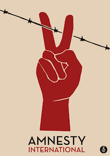
How have the creates of the advertisements created meaning through the use of Media Language? This advertisement by Amnesty International, a charity fighting for human rights across the globe, uses the contrast between peace and war to represent how they feel societies should be transformed. This opinion on creating equal and fair human-rights for everyone is clearly depicted in this advertisement. The main image used, a red hand showing a peace symbol holds the audiences main focus. The use of the colour red contrasts with the beige background, possibly referring to how supporters of Amnesty International can stand out and make a difference. This use of a peace sign in the advertisement is effective as it is a well-known across the globe, with the audience understanding its meaning without having toad in text or explanation. The size of this image is also relevant as, within the poster, it is the largest aspect. This may have been used to link in with the charities

ADVERTISMENTS: LUCOZADE & SHELTER

Comparison between the two advertisement overall message images text/font lighting These two advertisements are both very effective for their individual purposes, though both using very different styles to present their campaigns. The overall message that each advert showcases is very different, for instance the Lucozade campaign is very simplistic, using very minimal images and text rather than the advert by Shelter. Here the charity present their advert using three separate

ANALYSING SHELTER'S ADVERTISMENT

Image
How have they represented their agenda within this campaign? In this advertisement by Shelter, a homelessness charity, a strong message is given to the audience. This is delivered by the use of three separate images, each representing an individuals story on homelessness. This layout, with text and the charities logo on each separate image, allows the advertisement to be used in multiple ways. For example it could fill a billboard as it is shown above, using three images with three different stories to make a much larger impact on the audience. Or each segment of the advertisement could be used separately, for example in a tube station. By using such a layout, Shelter is increasing the likelihood of their advertisement being shown, therefore increasing awareness. Similarly, the font used helps to continue on the theme of awareness though also helping to add depth into the advertisement. The use of a slightly translucent fade of red makes the text readable though sl

ANALYSING LUCOZADE'S ADVERTISMENT

Image
How have they represented their product in the poster?  This poster by Lucozade is attractive to the audience, using a bold font and a simple layout to make it appealing to those interested. The audience for this advert are most probably interested in sport, therefore will connect with the elements used. Though, as this advert is for a major brand like Lucozade they can afford to place this on a billboard in a busy area, or in a major magazine for example. Hence the audience is vast for an advertisement like this, therefore the elements used must appeal to this large target market. The use of a very simplistic layout adds emphasis to the message behind the advertisement; with no unnecessary elements taking the focus away from the text and the image. The font used for the text, 'IN A DIFFERENT LEAGUE', is simple, though also bold and easily read. This is an important factor when finding a font for an advertisement on this scale, as it is likely to be shown

HOW DO RADIOHEAD AND MASSIVE ATTACK REPRESENT THEMSELVES WITHIN THEIR MUSIC VIDEOS

Image
   These two songs represent very different topics, with the lyrics in each representing almost opposite emotions and feelings towards others. Firstly, 'Unfinished Sympathy' by Massive Attack, presents the theme of romantic love. The lyrics used by the artists create a quite possessive and strong kind of affection towards the individual which the lyrics are aimed at. 'I know that I've been mad in love before', here the adjective 'mad' creating the possession behind the message of love. As well as this, the use of the first person throughout the song lyrics make the audience seem more attached to the writer as the story which is being shared becomes much more personal.  Whereas in Radiohead's 'Burn the Witch', the songs lyrics create an evil and negative theme throughout the entirety of the song. This is done by the constant reference to 'witches', for example 'red crosses on wooden doors' and 'if you floa

THE PARADISE PAPERS CASE STUDY

Image
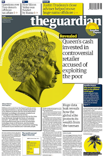
E.g. The Guardian Media Language On this Guardian front page, covering the first release of the story on the Paradise Papers, there is a clear colour theme. The use of a bright and bold colour like yellow makes the story stand out compared to the usual monochrome front cover page; this use of yellow could represent the gold colour of money or the sun in 'paradise'. The colour is repeated throughout the articles within the front page, helping to highlight the main elements and images. This use of smaller articles at the bottom of the page help to back-up the main article, providing readers with a deeper understanding of the topic by including related articles, almost like evidence for their viewpoint. As well as this, the overall layout of the paper is easy to take-in, with each aspect spread-out so to make sure the front cover page doesn't look crowded. Though the editor has still  made sure to include a large amount of copy at the bottom of the page, using th

THE PARADISE PAPERS STORY COVERAGE

Image
On Monday 6th November, the main headlines across nearly all the national newspapers covered leaked documents revealing the financial details of the super-rich. These stories outlined how many were allowed to keep money in off-shore locations in order to avoid paying taxes. E.g. The Guardian This front cover page which the Guardian produced on Monday 6th November, covering the story E.g. The Mail  

ADVERTISING - OLD SPICE ANALYSIS

Image
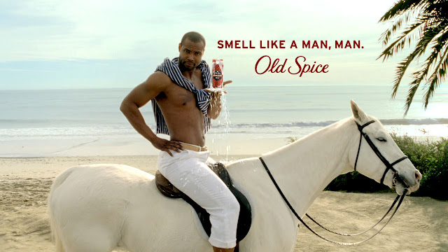
This poster advertisement appeals to both men and women, even though the physical product is for males only. Therefore the practical side of the advertisement will appeal to males, as they are who will be using the product; whereas the female appeal is more theoretical. This is known from the use of a male model, hence appealing to a heterosexual female, making him desirable and so the connotation which the female audience will then have with the brand, 'Old Spice'. Though the male audience will appeal to the text used within the advertisement, 'SMELL LIKE A MAN, MAN'. Here, this is clearly focusing on the male side of the audience, claiming how they will smell like a 'MAN' if they wear 'Old Spice'. This is a common stigma in society where males are forced to think and act 'manly', therefore advertisements commonly use this to connect with their male audience. Other parts of the poster also help to contribute to the engagement of the audience

RADIOHEAD RESEARCH

Image
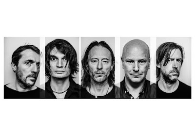
Formed in 1985, Radiohead is an English rock band, originally from Oxfordshire. The band consists of Thom Yorke, Ed O'Brian, Phil Selway and brothers Jonny Greenwood and Colin Greenwood. They formed, 'On A Friday', with the name referring to their unusual day of rehearsal. In late 1991, after a chance meeting between Colin and EMI A&R representative Keith Wozencroft, 'On A Friday' signed a six-album recording contact with EMI. Then, at the label's request, the band changed their name to 'Radiohead', taken from the song on their 'Talking Heads' album. Their music is categorised as either 'art rock', 'alternative rock', 'progressive rock', 'electronica and experimental rock'. This great contrast in different genes connected to Radiohead comes from how much each album differs, as well as each song within these albums.  Within their promotional material, Radiohead themselves don't

NEWSPAPER OWNERSHIP & REGULATION

Image
E.g. The Barclay's Brothers Press Holdings The Daily Telegraph The European The Scotsman Sunday business E.g. News Corporation, Chairman & CEO Rupert Murdoch The Times The Sun  E.g. Scott Trust Limited The Guardian The Observer E.g. Lord Rothermere's Daily Mail & General Trust plc The Daily Mail E.g. Richard Desmond's Northern & Shell Daily Express Daily Star E.g. Trinity Mirror Daily Mirror Leicester Mercury E.g. Alexander Lebedev & Lord Rothermere London Evening Standard E.g. Daily Mail & General Trust plc Metro Within the UK's media ownership there may be concern as there is a small number of major businesses who own multiple media companies each, narrowing the range of opinions that are published. This isolation of power represents wealth rather than knowledge; therefore at the expense of quality and creativity. Similarly, this links in with the idea of London centric, where the majority of media pr

MASSIVE ATTACK ANALYSIS

Image
How is 'street life' represented in the music video?  At the beginning of the music video, a close-up shot is used of steel silver balls being fiddled with in a gloved hand. This is shown with the diegetic sound of metal on metal, the harshness of  this sound then reflecting the gang which next comes into shot. Within these balls, a reflection of the sky and rooftops is shown, helping to establish the scene though without showing the audience too much detail, keeping them engaged. As well as this use of the unknown of the setting, the use of a gloved hand also helps to continue the mysterious aspect which the opening of this music video has. This shot then zooms out slightly, showing more of the scene. The continuous shot which is used from the offset, zooms out from the silver balls to a man holding with a dog with sunglasses on. This dog also helps to maintain the stereotypical rough elements of the 'street life', as the silver studs on its col

THE IMPACT OF TECHNOLOGICAL CHANGE ON NEWSPAPERS

Image
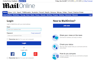
  A 'paywall' is the use of restricting access to internet content via a paid subscription. Newspapers began the use of a 'paywall' n 2010, helping to protect their revenue and profits as, what is now known as 'old media' is declining. More people are viewing their news online, therefore companies have had to accommodate to this change by adding a fee for viewers to look at full articles. E.g. The Daily Mail When looking at The Mail Online, viewers are able to read through hundreds of stories without hitting the 'paywall'. Though there is an option to 'log in, this allows users to comment on articles, also being able to look at how their comments compare to other users. As well as being able to have a Mail Online account, users can also subscribe. Here, this allows readers to access extra  information which users who use the standard website don't see. For example, the Daily Mail provides promotion subscriptions wher