ADVERTISING COMPARISONS

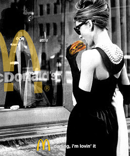
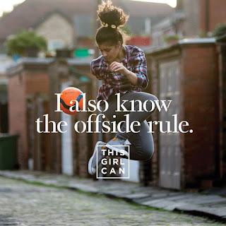
In both of these advertisements the theme of femininity is explored in two opposing ways. Firstly, in the McDonald's advertisement, the use of an original black and white image creates a classic aesthetic. This approach is emphasised by the use of a modestly dressed women, with her style referencing the fifties era. Whereas in the other poster, the theme is much more modern with the use of bright colours making it seem playful and almost childish. The image used is quirky in comparison, however also flirty, making the advert lighthearted. The brands have used these aspects as they are relevant to the different target markets. For instance, the McDonald's advertisement, I feel is aimed at an older market rather than their typical audience of children and young adults. I have made this conclusion due to the classic image which has been used, along with the black and white theme. McDonald's is a well-known fast food restaurant and so nearly all soci...


