WEBSITE - FIRST DRAFT EVALUATION
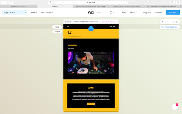
Home page
Upcoming events page
How well does my website meet the set brief?
E.g.
The brief states that firstly the website should consist of a homepage and then a second linked page, here I have met the brief requirements as I have created both a homepage and a linked page with information on the artists upcoming events. As well as this I am also required to include two original images within my website, which I have shown on my linked page, with each image relating to a different music venue. These images also help to represent my artist as they show a scene of a music gig which creates the impression that my artist is popular as the images show crowds of people clapping. The brief also requires an original title or name for a artist which I have produced; I also feel that the name i have created, LE1, is an original idea as I don't know of any other artist who has used a postcode to represent themselves. On my website I have positioned my artists name within a menu bar which was also mentioned within the briefs requirements.
The brief also states that the websites should include a section of information the artist I have created, which I have included in an about section within my home page. Finally, at a later date i will also link my music video I create to my website, where it will be positioned underneath a title, with a link straight to YouTube which fans can easily assess to watch the audio-visual content.
How does my website represent my artist and how does my website suit my target market?
I have used a very simplistic website design as I feel that this helps to represent my artist in a modern and possibly contemporary approach. I have also included a section titled 'FIND US' which within is a map with Leicester marked on, hence linking back to the ideas I have explored in the 'ABOUT' section. I also hope that by referencing the idea of an artist taking his fame and success back to his home area, as well as being known as the postcode for this area the initial goal the artist may have had cannot be forgotten. The idea behind this, I hope, will suit the briefs requirements of the AB demographic target market.
Think about each element of your website (title, colours, etc.), what elements of it need to improve? How will you achieve this?
I have used a colour theme which runs throughout my website, with black and yellow being the most prominent colours used. I feel that these colours work well for my website as the contrast between them creates the 'edgy' feel that my artist is representing. This colour scheme also helps to make my website seem bright and vibrant and so therefore keeping with the typical dance music genre.
I have used my artists name, 'LE1' as the title for my website as this helps to promote him and his business. For this and the other text which is included on my website, I have used a bold and modernistic font style as I felt that this matched the representation which I am aiming for. However I may change some of the lettering so that the titles stand out further, by either using a different font to any of the main text or by making it bold or underlined.
Are you happy with the original images you have taken? Do you need to retake them, if so what would you change?
I have used original images which I have taken at concert venues. I feel that these suit my intent and brief well as they are all from a first person perspective and so imply that the artist has a solid fan base. Similarly, I have also made sure that in all the images I have taken, you are able to see either peoples heads from the crowd or peoples hands clapping etc. I also like the idea of using images which are all black and white, as these link with the other colour theme used on my website, however by editing the original images to make them black and white sometimes, I've found make the images look of a lesser quality. Therefore I may need to retake some of these images so that the originals are of a higher quality, by using a different camera, so that then when they are edited to black and white the images still hold the aesthetic desired.


Comments
Post a Comment