THE BIG ISSUE - FRONT COVER ANALYSIS
E.g.
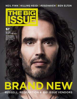
In this Big Issue front cover, the simplistic and minimal approach makes it very clear to the reader what the focus of the later articles is. The Masthead of the magazine is located in its traditional position, in the top left of the page. Its large size and choice of contrasting colour, matching the theme of the magazine cover, all help to make its iconic style stand out. The font of the Big Issue has a similar aesthetic as 'Eagle Book', a straight forward and bold font. The masthead also takes priority over other elements of the magazine cover, as it is positioned forward.
The main cover line, 'BRAND NEW', is also shown in the same yellow colour as the masthead. The use of this against the dark background helps to emphasise the meaning behind the cover line. The use of the pun helps to create the light humour of the following articles, as Russell Brand is well known for his humorous side. Underneath this main cover line, the sub cover line gives slightly more detail on what will be covered in the edition, 'RUSSELL, REDEMPTION & BIG ISSUE VENDORS'. Here the use of alliteration creates a subheading which is memorable for the reader. The main cover line and the sub cover line are located in the centre, at the bottom of the page. Due to this, naturally this is therefore the last piece of information on the cover which the reader reads. Though, on this example, this technique works well due to the minimal and simplistic theme; with very little other information to read prior.
The main image which is used on this cover, of Russell Brand, is the only image. Its size fits to fill the entire front page, with any text overlapping in front of it. Russell is shown looking directly at the camera, this eye contact makes him seem closer to the audience; therefore the reader may feel more obliged to go on to read his featuring article. The costume shown is minimal, as the headshot only includes his shoulders. Though here the reader can see a grey top with multiple necklaces; this is the exact image of how Russell Brand is depicted in the media. The Big Issue may have done this ironically, as along side the main cover line 'BRAND NEW', it could be implying that Russell has changed in himself. Possibly referring to how he wants to change his image which the media has given to him.
As the shot is a closeup, some makeup will have been used. Though as the model is male, the makeup is all natural, helping to airbrush his complexion. Though no makeup could have been use, as Russell still appears very natural; this is helped with the beard and longer hair. Finally the lighting used is also minimal as it creates no shadowing around his figure. This helps to keep up the simplistic theme of the cover page, implying that the information given on Russell Brand may also be stripped back, bearing all.
E.g.

In this Big Issue cover page, it shows a fitting tribute to George Michael. Due to this, the cover is simple and respectable, using a plain and almost monochrome colour scheme. The Big Issue masthead is smaller than the traditional size, this makes sure not to take the focus away from the tribute. This also shows that The Big Issue is a well established social enterprise, as the masthead is well recognised. It is located in its traditional position, in the top left of the page. As well as, being the original black and white colour theme, using the font with a similar aesthetic as 'Eagle Book', a straight forward and bold font.
The main cover line, 'GEORGE MICHAEL', is straight forward, allowing the reader to understand exactly what the edition is going to focus on. Similarly, if a tribute cover page had used a more complex title the attention would be taken off the tribute. The font used for the main cover line is similar to that which is used for The Big Issue, ('Eagle Book'). This use of a simple and bold font is effective as The Big Issue is sold on the street, therefore readers need to be able to read what the main article is going to be about whilst walking past, increasing the possibility of sales. The main cover line is centred to the right, with that and the sub cover line located at the bottom right of the cover page. As the text is in white, by being located at the bottom right-hand-side, it overlaps the black background of George Michael's top. Here this helps to bring the whole cover page together, rather than all the different aspects seeming separate.
On this cover page, the sub cover line includes a quote from John Bird, 'he understood the broken and the defeated, trying to get back on their feet'. Here this quote speaks volumes about George, giving the reader an initial insight into what the rest of the article is going to entail, and acting as a sell line for the magazine. This is also in a white font, printed in front of the black backdrop of George's top.
In this special edition tribute front cover, the main image is a colour shot of George Michael. This is the only image on the cover, with the backdrop and George's profile filling the whole page. The image has an old fashioned feel, as the backdrop is a speckled pattern, using browns and creams. Due to this, the image will help to take the reader back, making them remember George in his prime era. The image if of a photo which was taken, with George looking just to the right of the camera. One of the main focuses within the main image is the silver cross earring. This stands out against all the other elements of the cover page as it is metallic and bright, whereas the backdrop is quite monotone and plain. This could have been done to represent what was important in George Michael's life, again, giving the reader an insight into the following article within the magazine.
The lighting used for this main image is minimal, with no shadowing created behind his profile. Also, the clothes and the makeup used in the image is also very simple. George is wearing a plain black shirt, and no makeup, though the image may have been touched up when photoshopped. However this is unlikely as this image is a well known and almost iconic picture of him, therefore people may notice obvious changes if it was to be majorly corrected.
E.g.

In this Big Issue cover, the masthead is located in its original top left corner; this helping to make the magazine easily recognisable, especially on the street. Though the colour scheme which is used isn't that of the original black and white; a vibrant pink has been used for the bold lettering, with a white background. This masthead is also placed behind the main image, making it partially covered. The Big Issue can afford to not show all of its masthead, as it is well established so therefore readers recognise the magazine without the need for the entire masthead.
The main cover line of this edition is extremely simple, using the single word: 'ELTON'. Due to Elton John being such an icon, readers will automatically recognise his surname, linking it to him. The font used for this main cover line is 70's inspired, with the bubbly, fun and retro lettering. This choice of font matches perfectly with the vibrant hot pink which the font is printed in. This pink matches the masthead, helping to bring the cover together, with the same colour scheme throughout. Alongside this main cover line, the sub cover line: 'FEEL THE LOVE'. This is instantly recognisable as the lyrics to one of Elton's biggest hits. Though this may have two meanings, as the following article talking about Elton John could be referring to how he feels that their should be more love in the world; getting readers to listen to his song lyrics.
The main image which is used on this cover page of the Big Issue is of Elton John; the image is the only one on the cover, with it enlarged to fill almost the entire page. The image has clearly been edited to create the photograph look almost as if it has been drawn, creating a rough image. This editing has also helped to emphasise the bright and vibrant colours which have been used, as they have been blocked together. This technique has erased, seam lines for example, within Elton's clothes, therefore making larger space for the colour.
Elton is also pictured in his iconic tinted sunglasses, these, again match the vibrant pink which has been used throughout the rest of the cover page. As well as this, it also makes Elton even more easily recognisable, especially when readers are passing the magazine in the street. These colour choices also make this edition of the magazine even more appealing to the passing audience.

Comments
Post a Comment