Posts

Showing posts with the label ADVERTISING

ADVERTISING COMPARISONS
Image
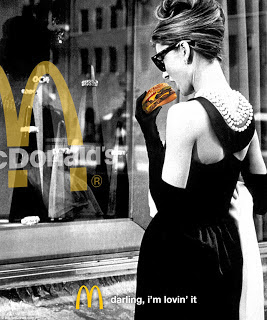
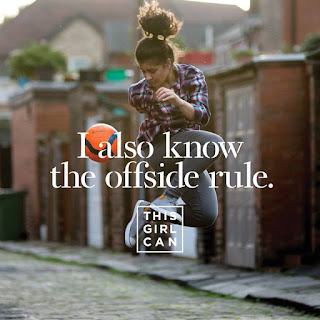
In both of these advertisements the theme of femininity is explored in two opposing ways. Firstly, in the McDonald's advertisement, the use of an original black and white image creates a classic aesthetic. This approach is emphasised by the use of a modestly dressed women, with her style referencing the fifties era. Whereas in the other poster, the theme is much more modern with the use of bright colours making it seem playful and almost childish. The image used is quirky in comparison, however also flirty, making the advert lighthearted.  The brands have used these aspects as they are relevant to the different target markets. For instance, the McDonald's advertisement, I feel is aimed at an older market rather than their typical audience of children and young adults. I have made this conclusion due to the classic image which has been used, along with the black and white theme. McDonald's is a well-known fast food restaurant and so nearly all soci...
REPRESENTATIONS IN ADVERTISING

Image
E.g. feminism E.g. consumerism  E.g. celebrity culture E.g. multiculturalism E.g. changing attitudes to sexualities E.g. postmodernism  

THE BIG ISSUE REVISION

Image
E.g. This Big Issue magazine cover uses intertextuality to link the release of the new Paddington Bear movie with the recent migrant crisis in relation to the EU referendum.  The location used for this Big Issue cover features a CGI scene of London, this is made clear though the inclusion of famous landmarks like Big Ben and the Houses of Parliament. The specific position which the magazine has chosen to place the character  Paddington Bear, on the walk way alongside the River Thames. This usage of a location which is well-known, especially to tourists, helps to link to the idea of rough sleepers as this is a typical area which is heavily used by rough sleepers.  It is likely that this location has been used as the trusted magazine acts as a social business providing employment opportunities for those in poverty. This came about in 1991 due to the increase in the numbers of rough sleepers in the London area. Hence, the use of a 'migrant' characte...

ADVERTISING & MARKETING - OLD SPICE

Image
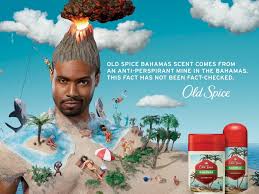
This campaign has been used by the brand Old Spice to widen their audience, reaching to a younger male target market. By changing their marketing campaign the brand is helping itself adapt to a more modern world. This has been presented through the use of an abstract advertisement, with multiple details creating a busy looking scene. Within the poster, it shows a male model who automatically draws in the audiences main attention. Then, from this further details are explored. The Old Spice model appears to be wearing a beach with his head blending into a volcano; this is hence presented to the audience as almost humorous due to the posters unrealistic traits. This aspect of the advertisement helps to pitch their product to the younger audience as this follows more typical conventions of advertisements which are aimed at this younger male audience. The brand has used a desirable, paradise-like setting for this poster. This is linking to the brands 'Fresh...

ADVERTISMENTS: LUCOZADE & SHELTER

Comparison between the two advertisement overall message images text/font lighting These two advertisements are both very effective for their individual purposes, though both using very different styles to present their campaigns. The overall message that each advert showcases is very different, for instance the Lucozade campaign is very simplistic, using very minimal images and text rather than the advert by Shelter. Here the charity present their advert using three separate

ANALYSING SHELTER'S ADVERTISMENT

Image
How have they represented their agenda within this campaign? In this advertisement by Shelter, a homelessness charity, a strong message is given to the audience. This is delivered by the use of three separate images, each representing an individuals story on homelessness. This layout, with text and the charities logo on each separate image, allows the advertisement to be used in multiple ways. For example it could fill a billboard as it is shown above, using three images with three different stories to make a much larger impact on the audience. Or each segment of the advertisement could be used separately, for example in a tube station. By using such a layout, Shelter is increasing the likelihood of their advertisement being shown, therefore increasing awareness. Similarly, the font used helps to continue on the theme of awareness though also helping to add depth into the advertisement. The use of a slightly translucent fade of red makes the...

ANALYSING LUCOZADE'S ADVERTISMENT

Image
How have they represented their product in the poster?  This poster by Lucozade is attractive to the audience, using a bold font and a simple layout to make it appealing to those interested. The audience for this advert are most probably interested in sport, therefore will connect with the elements used. Though, as this advert is for a major brand like Lucozade they can afford to place this on a billboard in a busy area, or in a major magazine for example. Hence the audience is vast for an advertisement like this, therefore the elements used must appeal to this large target market. The use of a very simplistic layout adds emphasis to the message behind the advertisement; with no unnecessary elements taking the focus away from the text and the image. The font used for the text, 'IN A DIFFERENT LEAGUE', is simple, though also bold and easily read. This is an important factor when finding a font for an advertisement on this scale, as it is likely t...

ADVERTISING - OLD SPICE ANALYSIS

Image
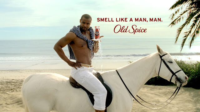
This poster advertisement appeals to both men and women, even though the physical product is for males only. Therefore the practical side of the advertisement will appeal to males, as they are who will be using the product; whereas the female appeal is more theoretical. This is known from the use of a male model, hence appealing to a heterosexual female, making him desirable and so the connotation which the female audience will then have with the brand, 'Old Spice'. Though the male audience will appeal to the text used within the advertisement, 'SMELL LIKE A MAN, MAN'. Here, this is clearly focusing on the male side of the audience, claiming how they will smell like a 'MAN' if they wear 'Old Spice'. This is a common stigma in society where males are forced to think and act 'manly', therefore advertisements commonly use this to connect with their male audience. Other parts of the poster also help to contribute to the engagement of the audience...