PRELIMINARY PRODUCTION EVALUATION
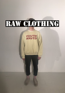
My two final posters use similar media advertisement conventions; as part of the brief entailed that it should be clear that the two different posters are advertising the same brand. The main images I used within my posters show two different models, with the male model appearing on both posters and a female model on one. I purposely chose for my models to have very simple poses, hence making sure that the audiences attention is all aimed towards the clothing. Then, on the second poster, I moved the male model into the background and also placed him side-on to the camera. This makes sure that the audience is able to see a different angle of the clothing, though helps to increase the continuity across the two advertisements. The female model I added into the second poster allows the brand to showcase how they are a diverse brand, appealing to both genders. Here, this is another factor which helps pull the posters together as the female model is shown in the same pose as the male model in the other advertisement.
In the first poster, I positioned the male model in the centre of the setting, again, helping to bring all the audiences attention to the clothing he is wearing. However I have used a more unique approach in my second advertisement; I made sure to add depth to my poster by placing the female model further forwards towards the camera. This technique also helped me line-up the placement of my brand logo when I went onto the editing aspect of my production.
In both my posters I have chosen to use the same white background. I felt that this adds a more modern aspect to my advertisements; this was a factor I feel is very important as typical fair trade fashion seems slightly dated in aesthetic. As well as this, the simplicity of the background helps the audience focus their attention on the models wearing the brands clothing.
In the foreground of my posters I had planned to Photoshop in plants and greenery, which would have helped add to the Fair Trade theme. However after completing my posters I decided that I wouldn't add in this stage as I feel that with the brand name and placement of the text it is clear enough for the audience that it is a Fair Trade fashion brand. I also felt that if I digitally added in greenery it may take away the overall modern theme of my posters, making them look 'cheesy' almost.
Additionally, the placement I have chosen for my brand name is the most important aspect of my designs. By positioning it over the faces of my models. Here, I have tried to refer to the treatment which off-shore farmers and producers of goods receive without Fair Trade; dehumanising them in the products the consumers then buy. Similarly, my advertisement hence also link to the ignorance many have towards Fair Trade and the positives it brings to those involved in the earlier stages of production, referencing how many are blind to this concept.
Within my posters I also used very minimal lighting, however I did chose to use slightly off-centred lighting. This helped to cast a shadow behind my model. Due to the stance I asked the model to do, it helped to create a clean and obvious shadow. This, I felt was very effective within my poster as the shadow also matched up with the brand name covering the shadows face.
To create my advertisements I had to use a specific production process to achieve my aspired outcome. After taking my images, I then had to upload these to Photoshop, where I then added to the images with the elements like my brand name. Prior to this task I had had very minimal experience with Photoshop and so to produce the correct aesthetic I was aiming for toke multiple attempts. Part of my production involved adding in the text to my posters though placing this text within black rectangles. Here I used skills within Photoshop which I hadn't previously used, for example, changing the order of the layers to move certain elements. As well as this, I also had to ensure that my text boxes were central to both the overall advertisement and the background image; for this I used a centralising tool, fitting the text to the formatted size of the poster.
Finally, to conclude I am pleased with the end products I have produced. I feel that they fit the original brief, as well as suiting my younger target market. However if I was to adapt my products I would probably edit in the plants and greenery which I had planned for in my itinerary. Though this would only be done if the edit in Photoshop had the correct finished look, as I was worried that with my minimal Photoshop skills that my poster could lose the seriousness of its underlying message.


Comments
Post a Comment