COMPARING THE UNSEEN ADVERTISMENT BY AMNESTY INTERNATIONAL TO SHELTER'S CAMPAIGN
How have the creates of the advertisements created meaning through the use of Media Language?
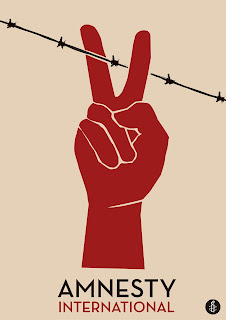


This advertisement by Amnesty International, a charity fighting for human rights across the globe, uses the contrast between peace and war to represent how they feel societies should be transformed. This opinion on creating equal and fair human-rights for everyone is clearly depicted in this advertisement. The main image used, a red hand showing a peace symbol holds the audiences main focus. The use of the colour red contrasts with the beige background, possibly referring to how supporters of Amnesty International can stand out and make a difference.
This use of a peace sign in the advertisement is effective as it is a well-known across the globe, with the audience understanding its meaning without having toad in text or explanation. The size of this image is also relevant as, within the poster, it is the largest aspect. This may have been used to link in with the charities main aims, as the want for peace is the greatest. The connection between this image of a peace sign and the black barbed wire, emphasises the contrast between the two topics of war and peace. The use of barbed wire creates connotations of conflict and war, as well as the use of the colour black, signifying negativity and how there is no happiness with war.
The link between the two images, showing the peace sign about to cut the barbed wire, shows the aim of the charity - fighting against conflict and gaining human rights. This image also gives the viewer connotations of powerfulness and control, taking action against what they believe is wrong.


Comments
Post a Comment